When a user browses a website, the first impression they have plays an important role in conversion. Web designers who invest time in UX likely experience an increase in their conversion rate. For a website, UX design is its backbone and is the process to boost user satisfaction. UX design includes usability, efficiency and performance of the website. But, a perfect UX design contains much more than the smooth navigation and an attractive layout. A great UX will automatically improve the browsing experience of website users. This leads to high traffic and increases in overall sales. Improving your UX will convert visitors into potential leads and brand reputation.
Here are 4 ways to improve the UX of any website:
-
Design a CTA ( Call To Action)
Call to Action (CTA) play an important role in website conversion, they are present in the form of buttons. The most popular CTAs are: “Start a trial”, “download the app”, “hire us” and several others. Using an eye-catchy and clear CTA improves the UX of a website and leads to a higher conversion rate. The best way to engage the user is to place it on every page of the website. Moreover, if a website has fold designed, it is crucial to keep CTA above the fold for proper visibility to the users.
Here are a few things to consider:
- Using colors in CTA to make it unique and engaging.
- CTA should be action-related and text should be subtle.
- CTA should not have more than 5 words.
-
Resolve 404 Errors
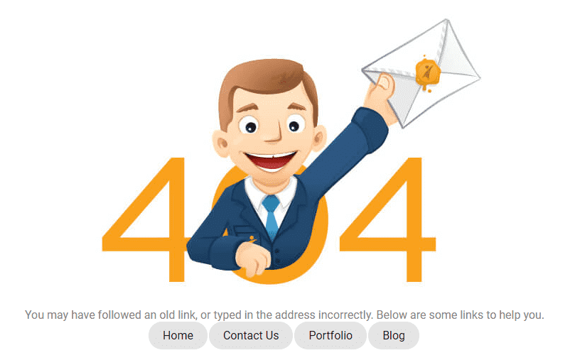
While opening a website, users usually expect to land on the page they were looking for. In case they get an error like 404 error in most scenarios, they will move to another website. Well, 404 errors drive users to competitor webpage leading to a loss in sales. 404 errors are easily avoidable and the steps to perform this are:
- Find out which webpage is displaying 404 errors and fix them immediately.
- Personalize the standard looking ‘404 error: page cannot be displayed’ message.
- Display relevant, and entertaining images on the error page to reduce any inconvenience to the user.
-
Relevant Images & Content
Images engage visitors by instantly lifting the webpage overall look. But, the type of image you select make a huge impact on the overall design of the webpage. The best way to avoid any dull layout is to skip stock photos. Many designers use stock photos as they are cheap and extremely simple to use but later they do more harm than good. Stock images might appear engaging in the beginning, but, after some duration, the users feel these stock images are dull.
Original photos have a realistic feel that drive visitors and the user can connect with them easily. On the other hand, stock images are overused making it unappealing. Another thing that experts reveal about using the stock photo is a message is spread that designers have not invested efforts in website design. Also, it seems duplicate as they have already seen them earlier. So, always use relevant and genuine images, no matter how simple they might appear.
-
Fast Loading
If your website loading speed is slow, it will annoy the visitors who will move to another website having faster loading time. It has been observed that a website taking more than 2-3 seconds in loading, the user skips the website. Also, a user decides on the basis of loading time to navigate ahead in the website or not. Hence, if the landing page is slow, chances are very high that the user will not get converted. Remember, improving the loading speed of the website is not sufficient. It is important to optimize it for mobile users as well. Mobile users constitute over 50% of internet traffic nowadays.
Wrapping Up:
UX design should be planned to keep end-user in mind to boost conversion. The above tips only show how a user-centric plan can keep users engaged, active, and loyal. A great UX is not only about offering useful information but it is about providing useful data engagingly and pleasingly. No matter the quality of service or product you offer; if it is not attractive enough to catch the users attention, it is not worth valuable.
Author Bio:
Sneha Rawat is an experienced developer associated with OrangeMantra, a leading Mobile app development company known for translating ideas into reality. She loves writing informative blogs on latest & trending technologies.


