In the dynamic world of web design, the quest for interactive and visually striking websites is more important than ever. Adobe Flash was once a revolutionary tool for creating engaging web experiences, but as it has faded, the need for innovative solutions has grown. Scalable Vector Graphics (SVG) has emerged as a powerful alternative, meeting the demand for interactive and lightweight animations. SVG provides clear, resolution-independent graphics that can adapt to any screen size and be easily manipulated for dynamic effects.
In this blog, we explore why SVG is a valuable technology and how designers and developers can take advantage of it.
What are Scalable Vector Graphics?
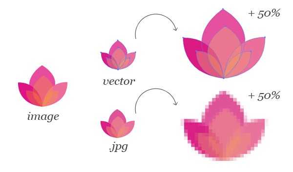
Scalable Vector Graphics (SVG) is an XML-based vector image format that allows for two-dimensional graphics with support for interactivity and animation. Unlike raster images, which are composed of pixels, SVG images use geometric shapes such as points, lines, curves, and polygons to represent different parts of the image. This makes SVG images resolution-independent, meaning they can be scaled to any size without losing quality, making them ideal for responsive web design and high-resolution displays.
SVG is a W3C standard and is widely supported across all major web browsers. It can be manipulated using CSS and JavaScript, allowing for dynamic changes in colour, shape, size, and other properties. This versatility enables designers and developers to create rich, interactive graphics and animations that are lightweight and perform well across various devices.
Why you should use SVG graphics on your website?
When it comes to adding images to your website, you either choose raster or vector. A raster image is typically a photo made up of pixels with a set resolution. It loses quality when scaled up and can appear grainy.
Meanwhile, a vector image is made using lines, points and shapes. You can use it to any size without losing quality, but such images are restricted to how much detail they can represent- so they are best used for elements like icons, logos and illustrations etc.
“All the segments inside SVG can be animated in order to generate inspiring interactive experiences or animations that can have a nice effect to the interface, icon or the image.”
A good website needs a responsive design- in which images often need to be utilized for a variety of screen sizes. Although there are many approaches to challenge these issues with raster images-there is an easier solution – i.e. SVG.
SVG or rather Scalable Vector Graphics are image types that are unanimously supported across all browsers- desktop and mobile alike. They are also largely adopted by top performing websites this year- with statistics showing the SVG image file format websites trending from just4.1% in Aug 2017 to 13.2% in Aug 2018..
Advantages of Using Scalable Vector Graphics
The advantages of using them for web designs are enormous- let’s discuss the biggest reasons why you need to use SVG graphics on your website –
Scalability and Responsiveness
One of the major benefits of SVG is that it is resolution-independent. Images can be scaled the same way we scale other elements in responsive web design. The image looks high-definition on any display – be it on high pixel density display of your latest smartphone or low pixel density display of a standard desktop. So, on a retina display where a JPG may appear blurry if it’s not large enough, SVG will still look crisp.

SVG Animation
All the segments inside SVG can be animated in order to generate inspiring interactive experiences or animation can have nice effect to the interface, icon or the image. Animation can be prepared using the CSS or via SVG’s ‘<animate>’ tag or even by the Web Animations API in JavaScript etc.
Meanwhile, the SVG animation is at an intriguing point in development, considering Google (which had previously deprecated SMIL- SVG animation tag in Chrome 45 for CSS animations and Web Animations API) has rescinded its deprecation.
File Sizes
As SVG is Vector in nature (image being drawn from a set of coordinates)- their files sizes when optimized are smaller compared to any other image file type. There are many ways to optimize SVG, like for instance, manually removing points and groups and command line tools- however, SVGOMG has a GUI and a number of options to tweak presenting you visually the changes that are taking place during the optimization.
As Scalable Vector Graphics can be animated, complex as well as responsive, there is no need to hesitate in using them for traction-generating images or images on a blog post or any other online media etc.
SVG has a Navigable DOM
SVG inside the browser has its own DOM. It is treated as a separate document by the browser and then positioned inside the normal DOM of the page. This is significant for the “viewbox” property, as Creative Bloq explains “we can draw our image on a canvas of any size, but then display it in browser at another, all without updating the properties inside the SVG. This separate, navigable DOM is also how we interact with elements inside SVG using CSS and JavaScript”.
Performance and Editing Capabilities
Utilizing inline SVG is advantageous to the website performance because it removes the HTTP request requirements to load in an image file. Because there is no file requirements to download- this leads to smaller loading times for a page. All this results in your website appearing faster to the visitors- enhancing the user experience.
SVG files are one of a kind in that they can be edited in graphics editing programs (such as Illustrator) like other images, however, also in a text editor where the mark-up can be attuned directly.
Style-Control
One advantage of using the inline SVG method is that it permits you to control the styles within your image. Utilizing class names or IDs, you can style elements inside of SVG only using marginally different properties to those we would normally utilize- so instead of “color” we will use “fill”, instead of using border we will use “stroke” etc. There are some bounds to styling SVG that come from the way you are using SVG in the page. For e.g. if you are using SVG as an image tag you will not be able to style the elements inside in Explorer, however, there is a polyfill – svg4everybody which can offer you a solution to this problem.

SVG is Interactive
You can use JavaScript to interact with elements inside of the SVG- due to the navigable DOM. This allows you to create interactive elements using SVG the same manner you’d with CSS and HTML. You can also apply animations via JavaScript using the new Web Animations API permitting both simple and complex interactions and animations to be programmed. Furthermore, there are also many JavaScript libraries you can utilize which have been created to speed up SVG workflows.
Therefore, as it stands SVGs are the best option used for low-intensity artwork- simple graphics, logos, and icons etc., plus they are also the most beneficial tool for displaying vector-based images on your website, so go ahead and try them now!
Please add the examples quoted in the other document you shared. But you can shorten it.
SVGs have an avalanche of practical use cases, here are the most significant ones.
-
Logos
Logos and icons often share the same primary requirement of needing to be clear and sharp at any size- be it from a button to a large billboard – making them the most ideal candidate for Scalable Vector Graphics. See the example here
-
Icons
Websites world over are filled with icons- they are universally understood, at least when used correctly and they shorten the time it takes for a user to process an interface.
Icons these days are often applied to the websites through web fonts, however, they can also be injected into a page as SVG. Clear and crisp icons are the best.
-
Illustrations and Diagrams
Any traditional drawings, illustrations, and diagrams that may be produced with a pen and pencil can be translated perfectly into the SVG format. See the example here
-
SVG Animation
Through JavaScript and CSS3 a number of possibilities in animation has opened up to the web. You can create eye-catching animations, including SVG line drawings. The SVG can interact with CSS animation and its own built-in SMIL animation ability as well. See the example here
-
Charts, Graphs and Infographics
You can use Scalable Vector Graphics to plot data and update it dynamically based on user actions or some events, like for instance SVG Infographic or SVG interactive map etc. See the example here
-
Everyday Graphics
Using graphics on a website? Consider if you can do it on an SVG format. Now, photography can be one of the examples where you can’t use SVG- but for everything else- you can give it a go. See the example here
-
Interfaces and Applications
SVG enables to create challenging interfaces and incorporate it with HTML5, web-based applications, and rich Internet applications (RIAs).
Limitations of Scalable Vector Graphics
SVG files are excellent for web icons, logos, and illustrations, but they do have their limitations. While SVGs are ideal for creating scalable graphics, they can’t match the realistic detail of high-resolution photographs. Additionally, SVGs have seen widespread adoption only since around 2017, so compatibility issues may still arise with older technologies. For instance, older browsers such as Internet Explorer 8 do not fully support SVG files.
Scalable Vector Graphics (SVG) represents a significant advancement in web design, offering a robust solution for creating interactive and visually engaging content. SVG’s scalability and resolution independence make it an excellent choice for logos, icons, and illustrations, ensuring that graphics remain sharp and clear on any device. Its support for animation and dynamic manipulation adds another layer of versatility, allowing designers to craft visually compelling and responsive web experiences.


